

Brand
Guidelines
This page is your starting point for representing the Diversified brand with clarity and impact. You’ll find essential brand assets and simple guidance on how to use them consistently.
Download GuidelinesDiversified Logo
Use the correct version every time: full color on light backgrounds, inverse (white) on dark. Don’t stretch, recolor, or add effects. Consistent use keeps our brand strong.
Logo with Tagline
![]()
Logo without Tagline
![]()
Incorrect Logo Usage
To preserve the integrity of our logo, we must use it correctly and consistently in every application. Never alter, distort, or redraw the Diversified logo. Proper use of the brand logo is crucial to showcasing, defining, and differentiating Diversified from its competitors. Improper use, such as the examples shown here, dilutes the power of the brand, and weakens brand communications.

Logo Clear Space
This example shows the minimum amount of blank clear space that must be left around the Diversified logo to ensure it is easily recognizable and identifiable from its background. No graphics or text should be in the clear space zone. To achieve proper clear space, follow the standards illustrated here. To ensure the Diversified logo is not overlooked, it should not be produced a size less than 1.25 of an inch.

Download Logos
Print: .EPS | CMYK | 300 DPI
Digital: .PNG | RGB | 72 DPI
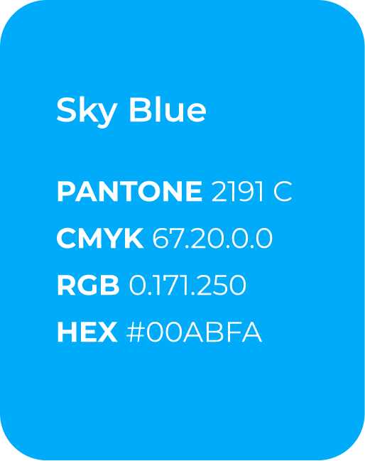
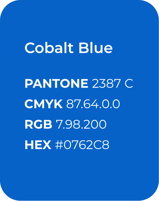
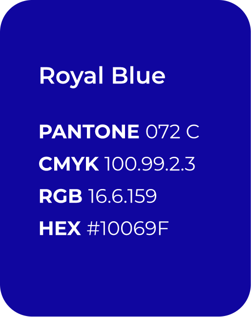
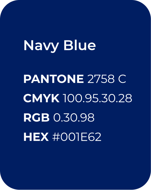
Color Palette
Primary Colors
The primary colors are the main colors that should be used when creating content for the brand.
They were chosen to reflect and convey the tone and personality of the Diversified brand and help distinguish it from its competitors. To maintain the integrity of the primary brand colors, they should only be reproduced per the specifications outlined here at 100%. Full-bleed expressive application is allowed for all primary colors.
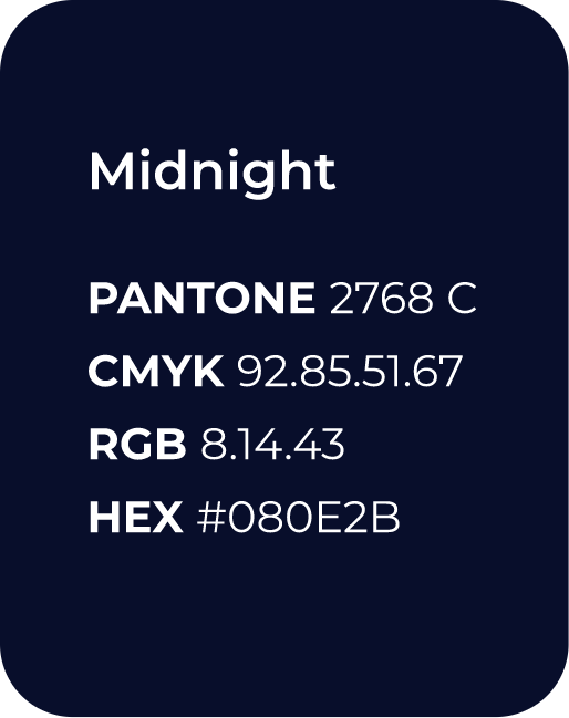
Secondary Colors
Additional colors for all needs.
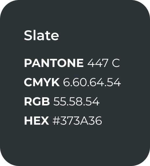
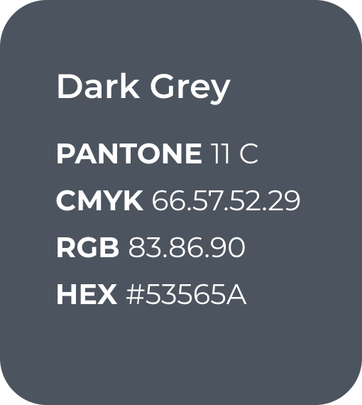
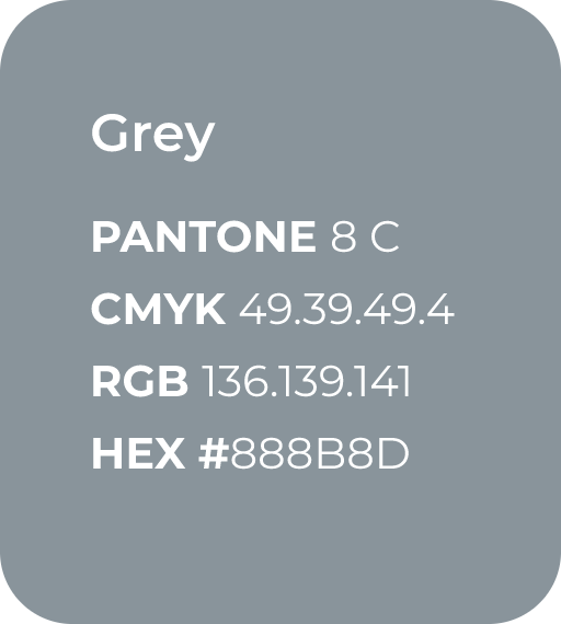
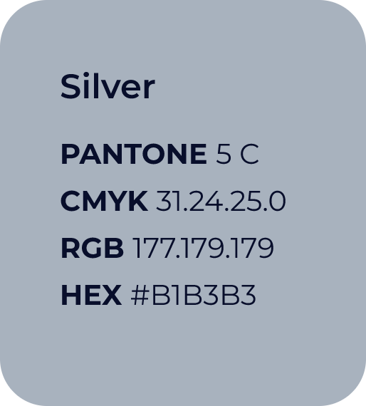
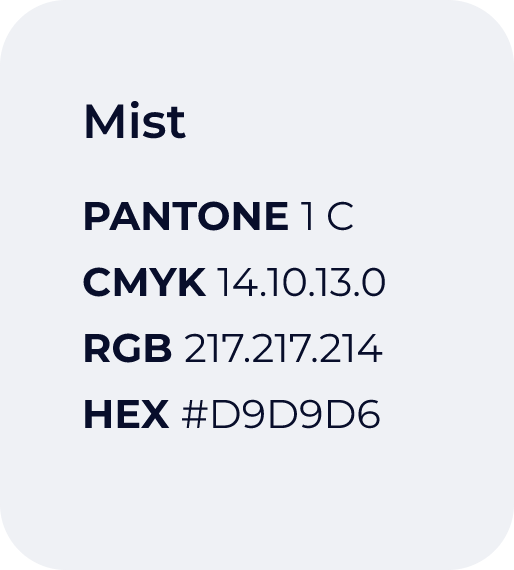
For other limited, nuanced usages, the accent color palette may be used.

Crimson
PANTONE 3517 C
CMYK 16.100.100.7
RGB 193.0.22
HEX #C10016

Red
PANTONE 185 C
CMYK 4.100.92.0
RGB 228.0.43
HEX #E4002B

Orange
PANTONE 715 C
CMYK 0.49.90.0
RGB 252.150.48
HEX #FC9630

Plum
PANTONE 248 C
CMYK 43.97.0.0
RGB 165.17.158
HEX #A5119E

Capri Sea
PANTONE 3262 C
CMYK 72.0.38.0
RGB 0.191.178
HEX #00BFB2

Tiffany
PANTONE 3242 C
CMYK 49.0.23.0
RGB 113.219.212
HEX #71DBD4
Typography
Primary Fonts
The Montserrat font family has been chosen as the primary typeface.
It has a clean and contemporary look that combines geometric simplicity with modern proportions. Its understated design offers flexibility and versatility, and it is a universal font that can be easily accessed, used, and viewed across a wide array of platforms.

Download Montserrat

